
Human clarity
Complex payment systems expressed with direct, approachable language.
A new chapter
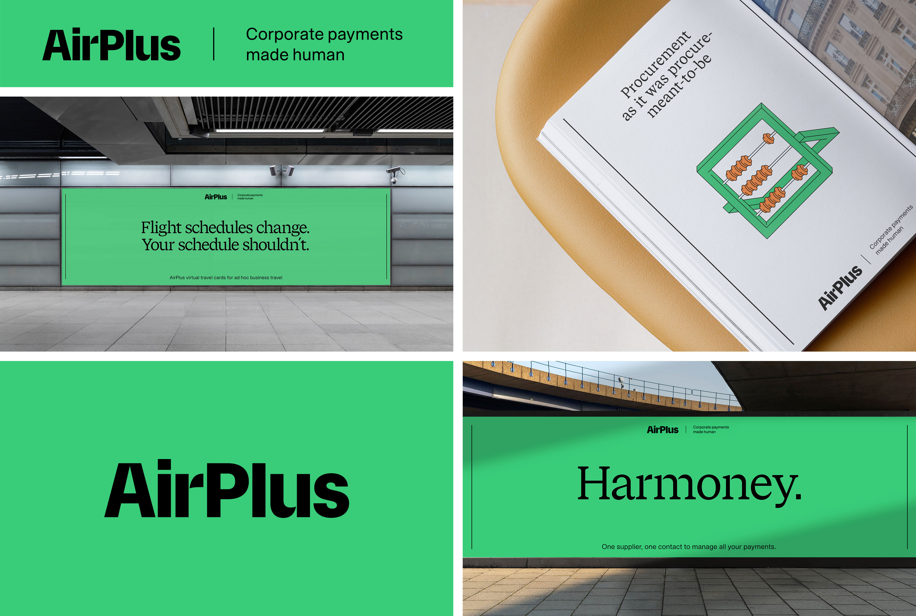
Corporate payments made human—a trusted global brand reimagined for its future as part of SEB.
The transformation
Following its acquisition by SEB from Lufthansa, AirPlus entered one of the most significant transitions in its history. The brand needed to express a new strategic direction while carrying forward the expertise, recognition and trust built over decades.
The transformation created a coherent foundation for this next chapter—bringing identity, communications and product experiences together around one clear, human idea.
The strategic idea
Complex payment systems expressed with direct, approachable language.
A bold typographic voice brings intelligence and character to every message.
Products placed in the real environments and moments they are designed to improve.
The design challenge
How do you signal meaningful change
without losing what people already trust?
Identity system
The renewed wordmark, editorial typography and disciplined layout system give AirPlus a distinctive voice across corporate, product and campaign contexts.
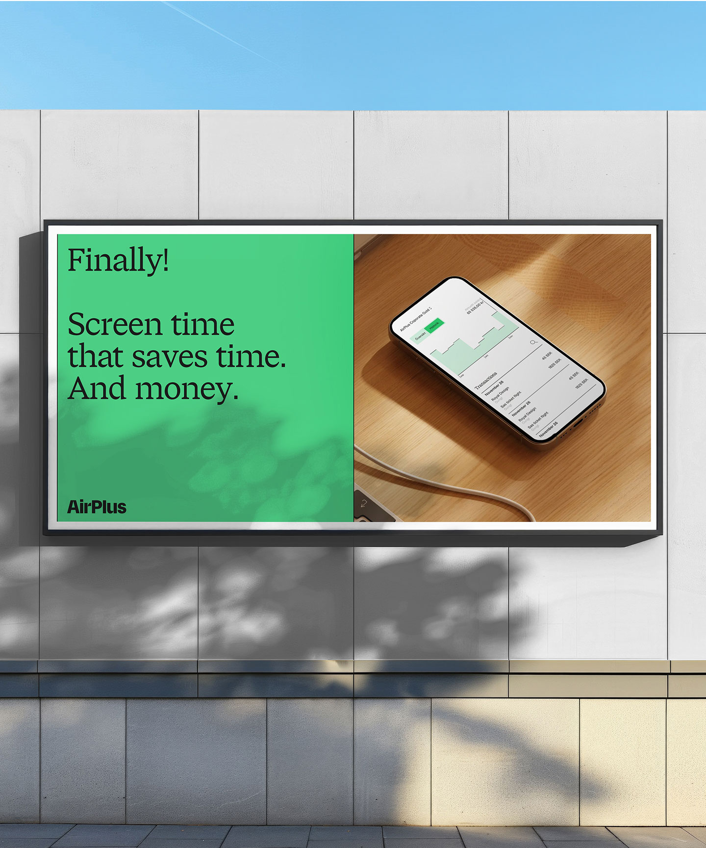
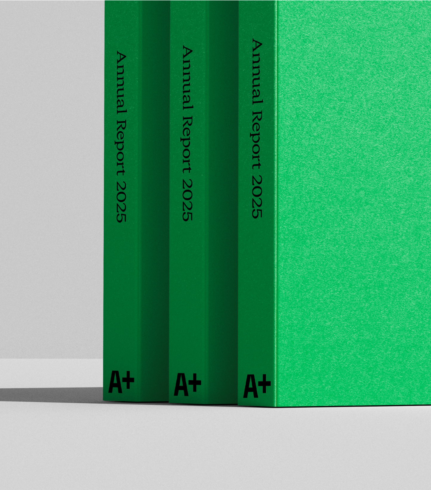
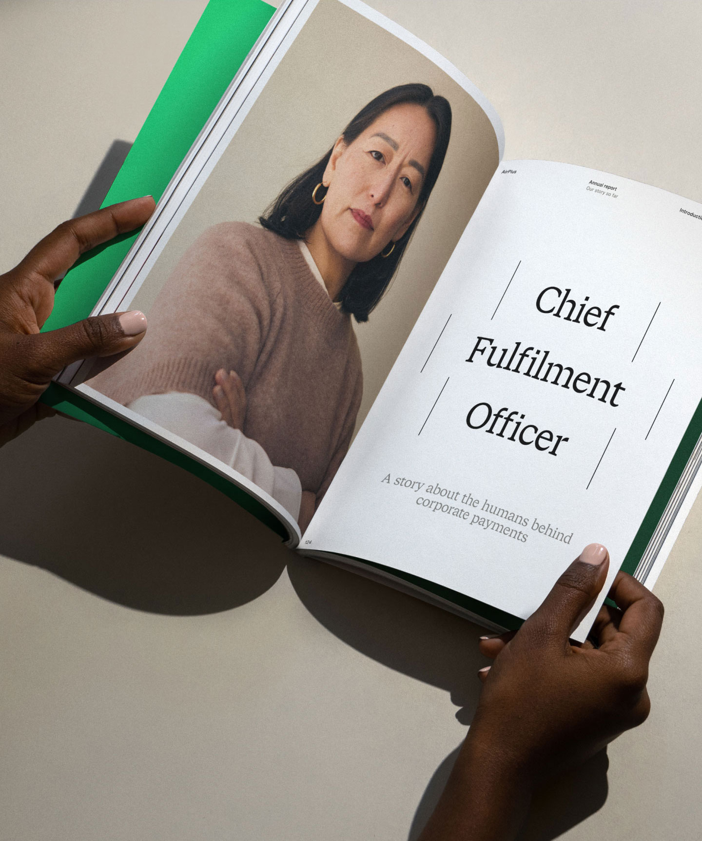
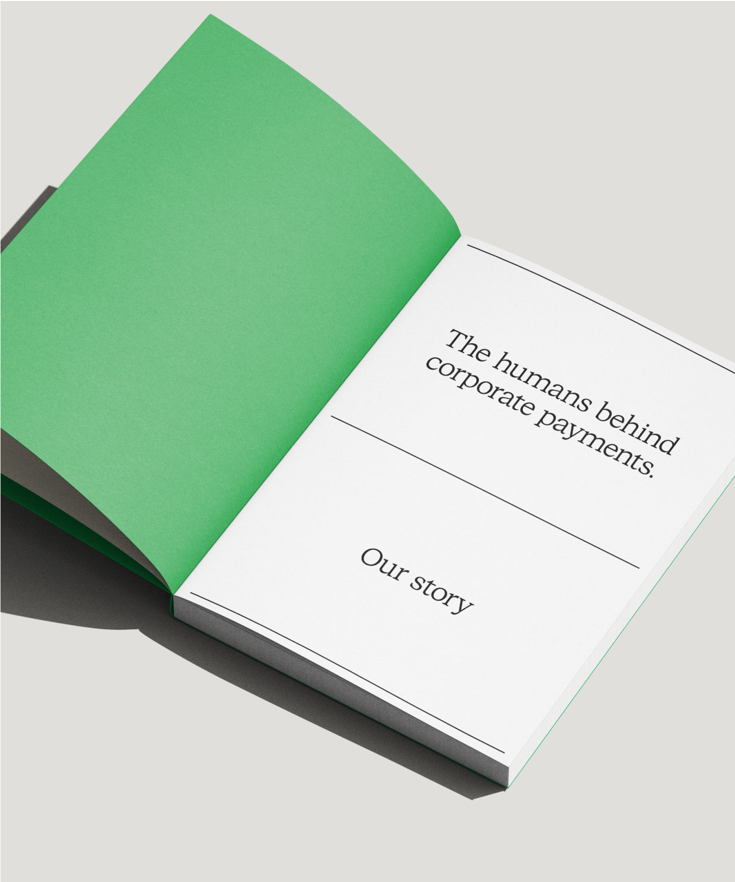
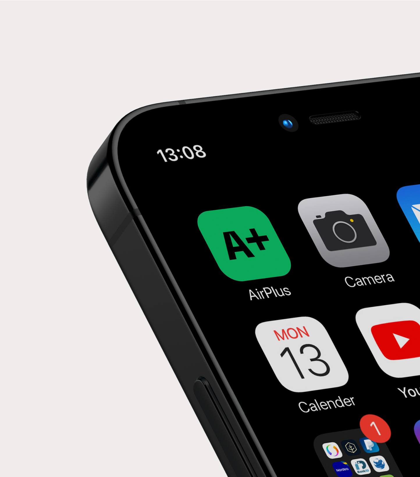
Illustration language
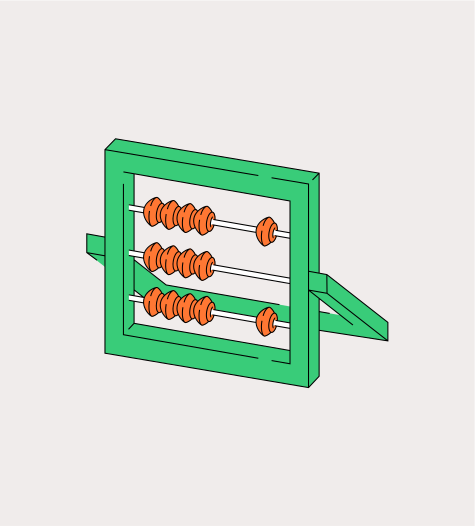
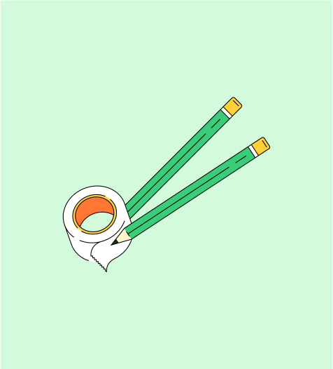
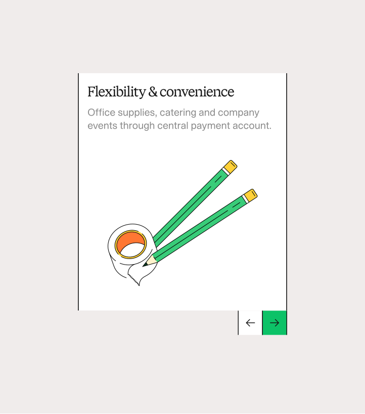
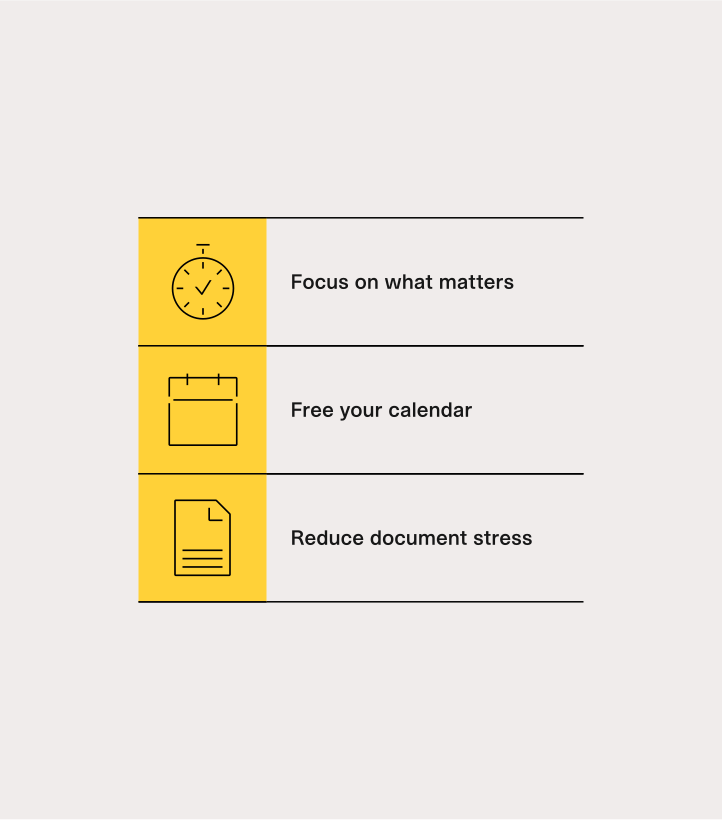
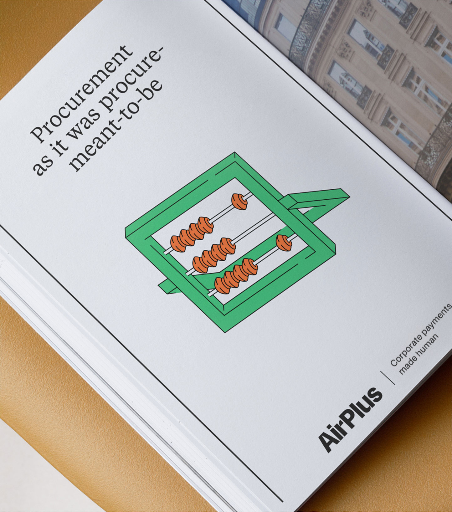
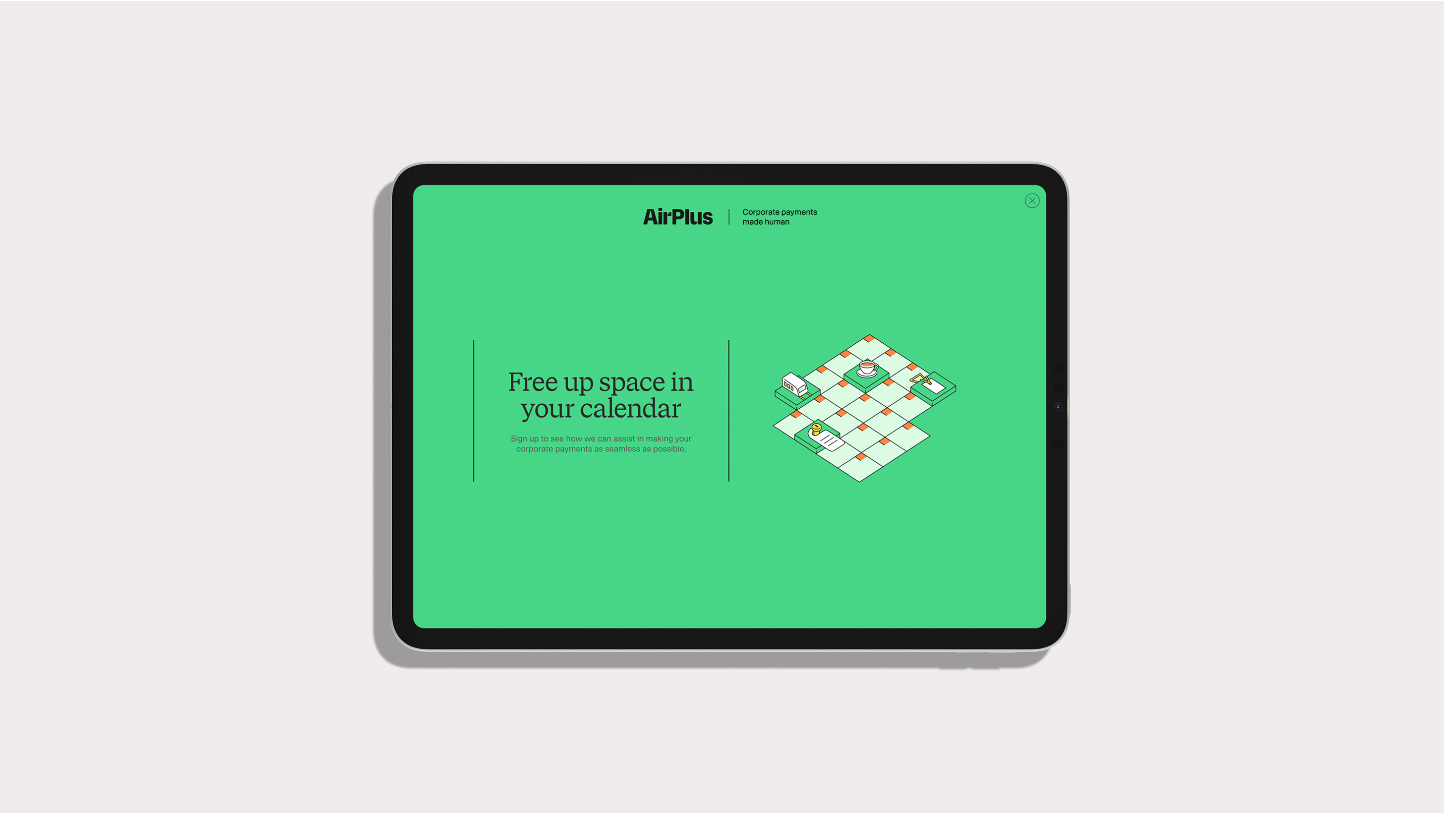
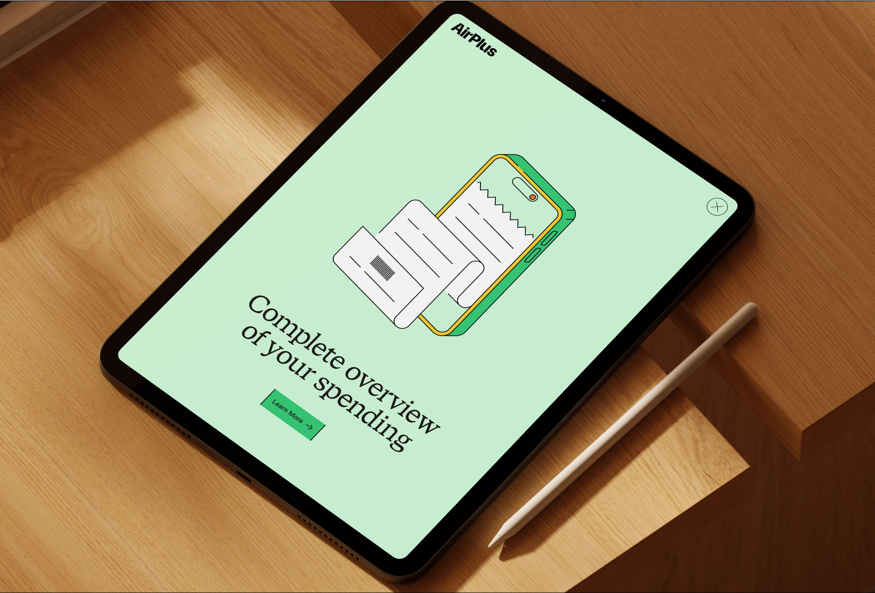
A modular illustration family makes complex financial ideas immediately legible—adding warmth without sacrificing professional confidence.

Digital experience
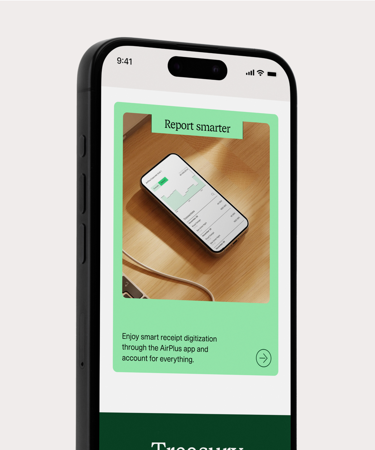
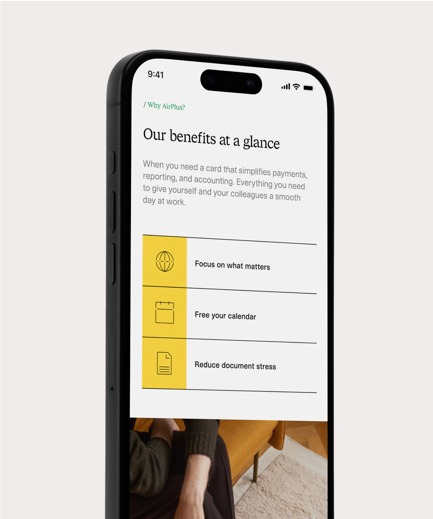
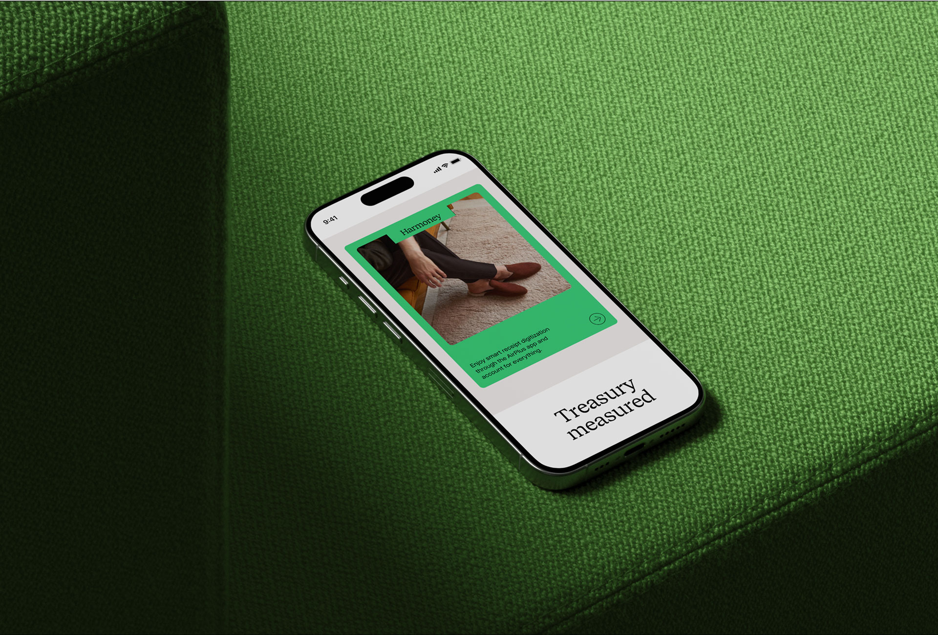
The identity moves naturally from product storytelling to utility—using consistent frames, type, colour and interaction cues across mobile and tablet experiences.
Brand in motion
My role · Design Lead
Creative leadershipProviding design direction and signing off brand expression across major touchpoints.
Brand governanceEvaluating work through the lens of brand strategy, clarity and consistency.
Design systemsHelping shape scalable systems that support teams beyond the launch.
Agency partnershipCollaborating closely with the agencies and internal stakeholders involved.
Part of a longer story