A precise wordmark with generous spacing, balanced by a quiet red seal.
Archive 03 · Spec brand & packaging
YŌHAKU
The ritual of
slowing down.
A contemporary Japanese tea identity shaped around ma—the meaningful space between things.
Strategy · Identity · Packaging · Campaign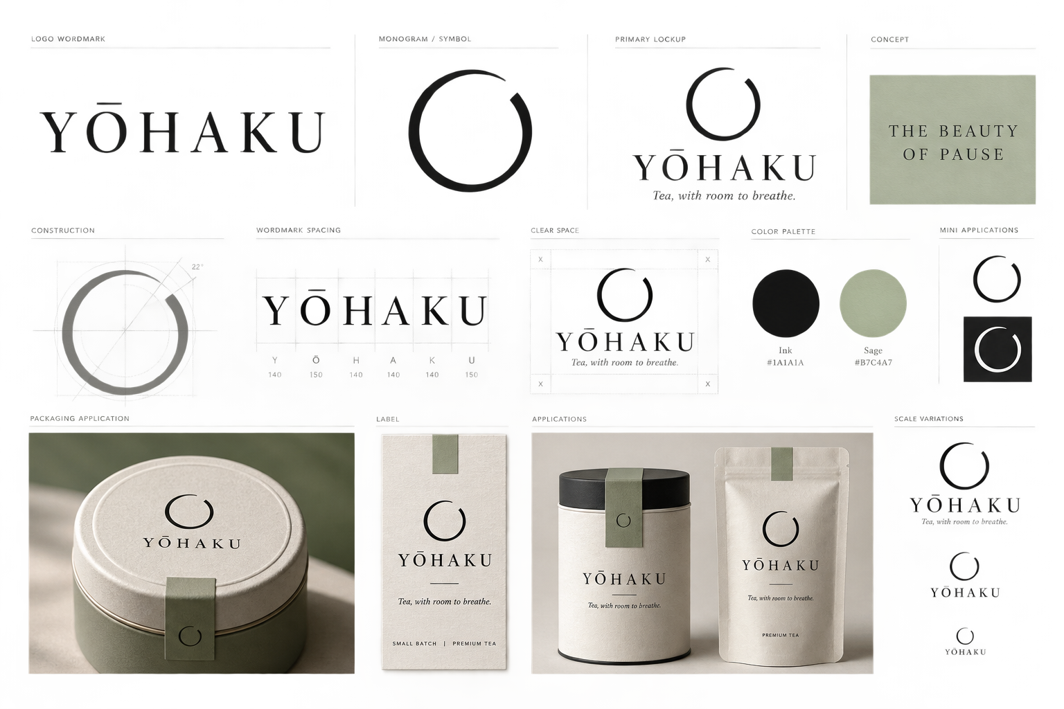
01 · The idea
Tea with room
to breathe.
YŌHAKU means “blank space.” The brand turns that idea into a quiet ritual: less visual noise, considered materials and a moment that belongs only to you.
Not escape.
Not indulgence.
A deliberate pause.
02 · Visual language
Restraint becomes
recognition.
A minimal monogram that connects contemporary packaging with Japanese craft.
Negative space is treated as an active design element—not an empty one.
03 · Packaging system
One ritual.
Five expressions.

01Sencha02Genmaicha03Hojicha04Matcha05Sakura
04 · Campaign direction
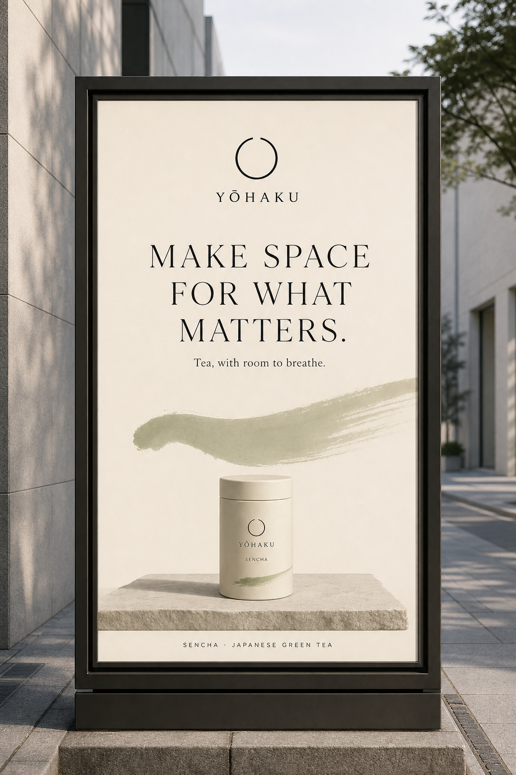
Make space for
what matters.
A calm invitation in a category often crowded with provenance claims and decoration. The product stays central; the world around it becomes still.
The ritual of slowing down.