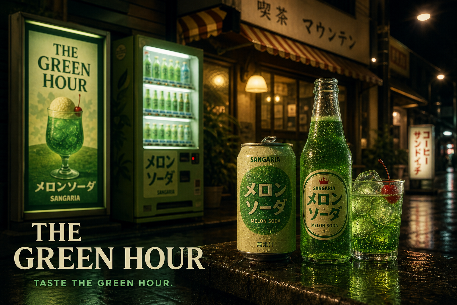
Speculative beverage refresh · Japan
SANGARIA
Taste the
green hour.
A familiar Japanese melon soda reimagined as a small, vivid ritual for the hour when daylight gives way to neon.

The opportunity
Keep the flavour.
Renew the feeling.
Rather than making the drink feel more Western or overly premium, the concept turns up what already makes it memorable: unmistakable colour, playful refreshment and a distinctly Japanese sense of place.
- Role
- Creative direction · Identity · Packaging
- Scope
- Speculative brand world · Campaign system
- Direction
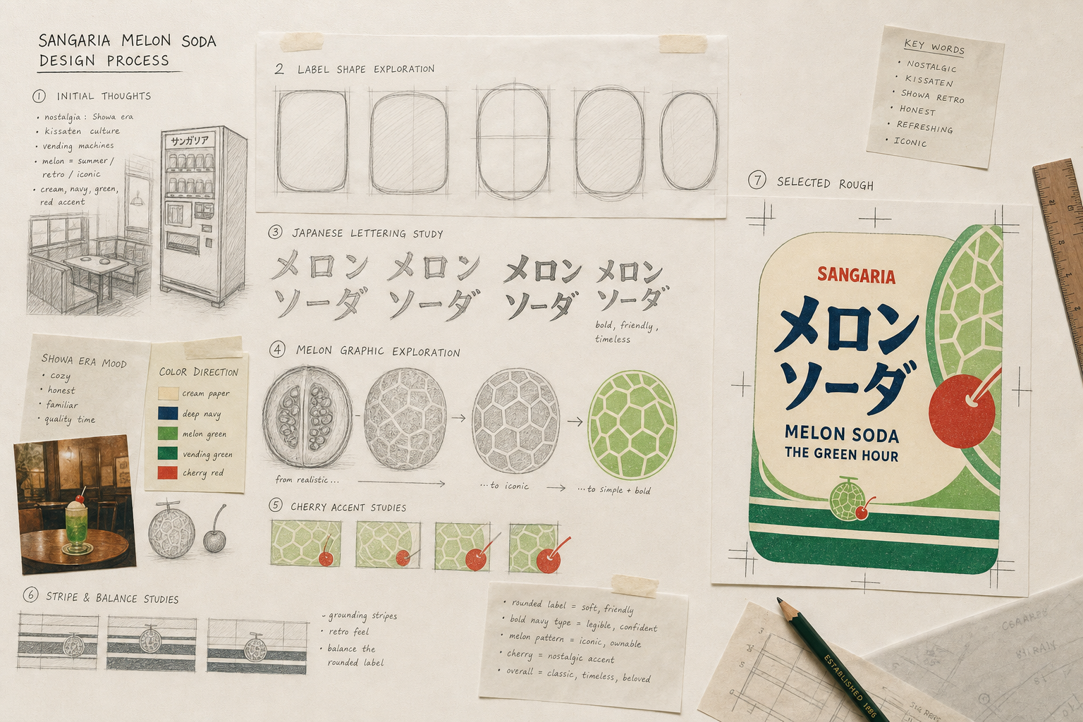
- Kissaten nostalgia meets vending glow
The creative thought
Nostalgia,
switched back on.
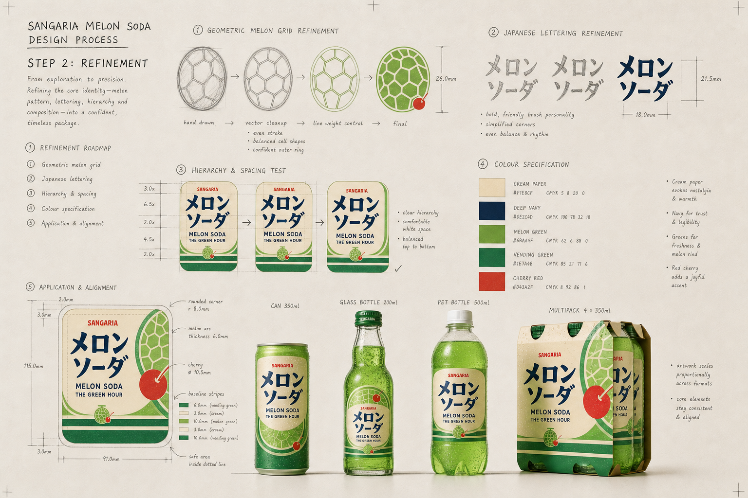
The identity moves between two moods: soft ivory and traditional café red by day; saturated melon green and midnight navy after dark.
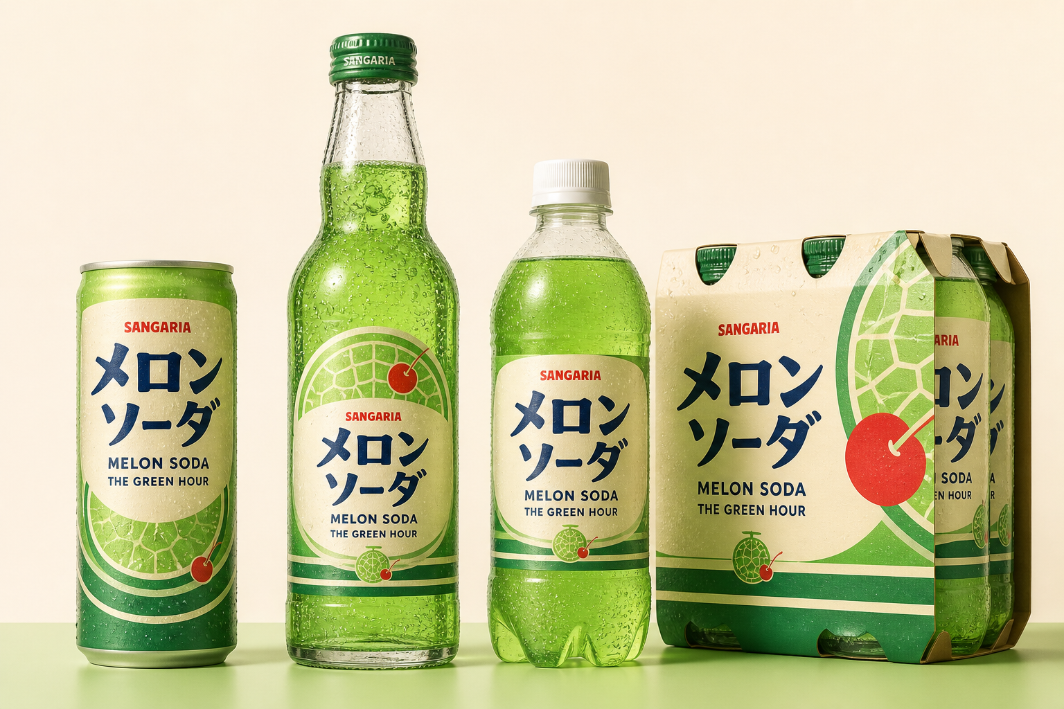
Packaging system
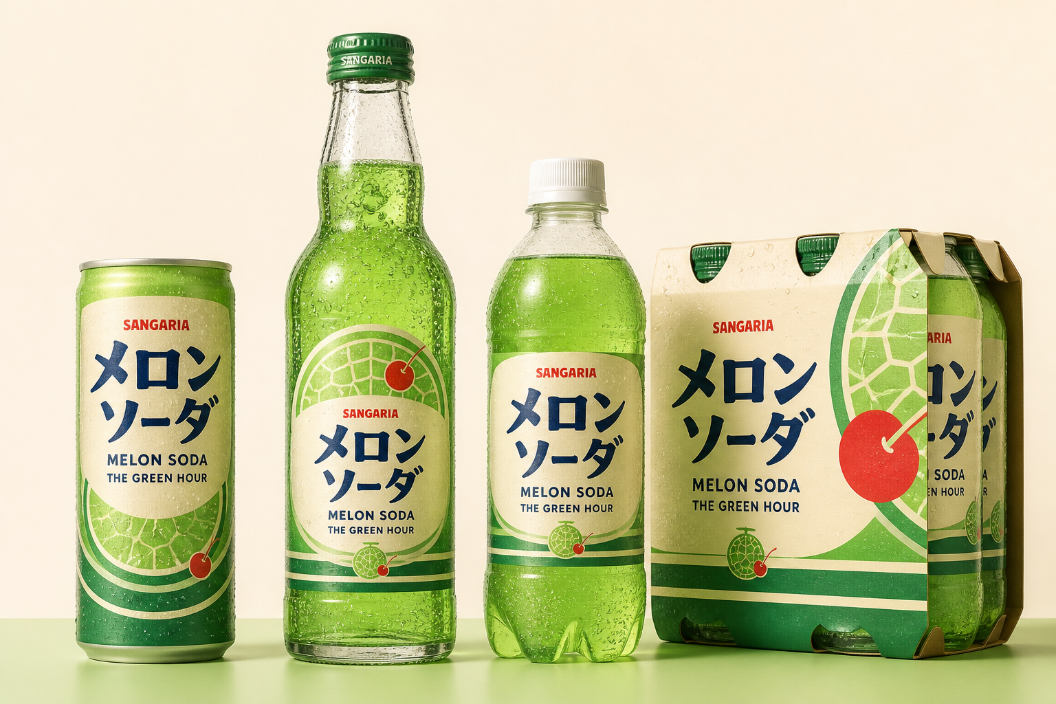
Familiar from across the aisle.
Fresh up close.
01Familiar
Protect the bright green signal and joyful accessibility.
02Vivid
Build instant shelf recognition through bold, minimal composition.
03Collectable
Use seasonal scenes and formats to invite discovery.
Campaign expression
When the city turns blue,
melon turns electric.