
An open form suggests movement into a clearer stage without promising a fixed destination.
Archive · Brand identity & experience
noemara
A practice shaped around
understanding.
A complete identity system for a Toronto psychology, psychotherapy and psychometry practice—created to balance clinical clarity with human warmth.
Naming · Strategy · Identity · Print · Digital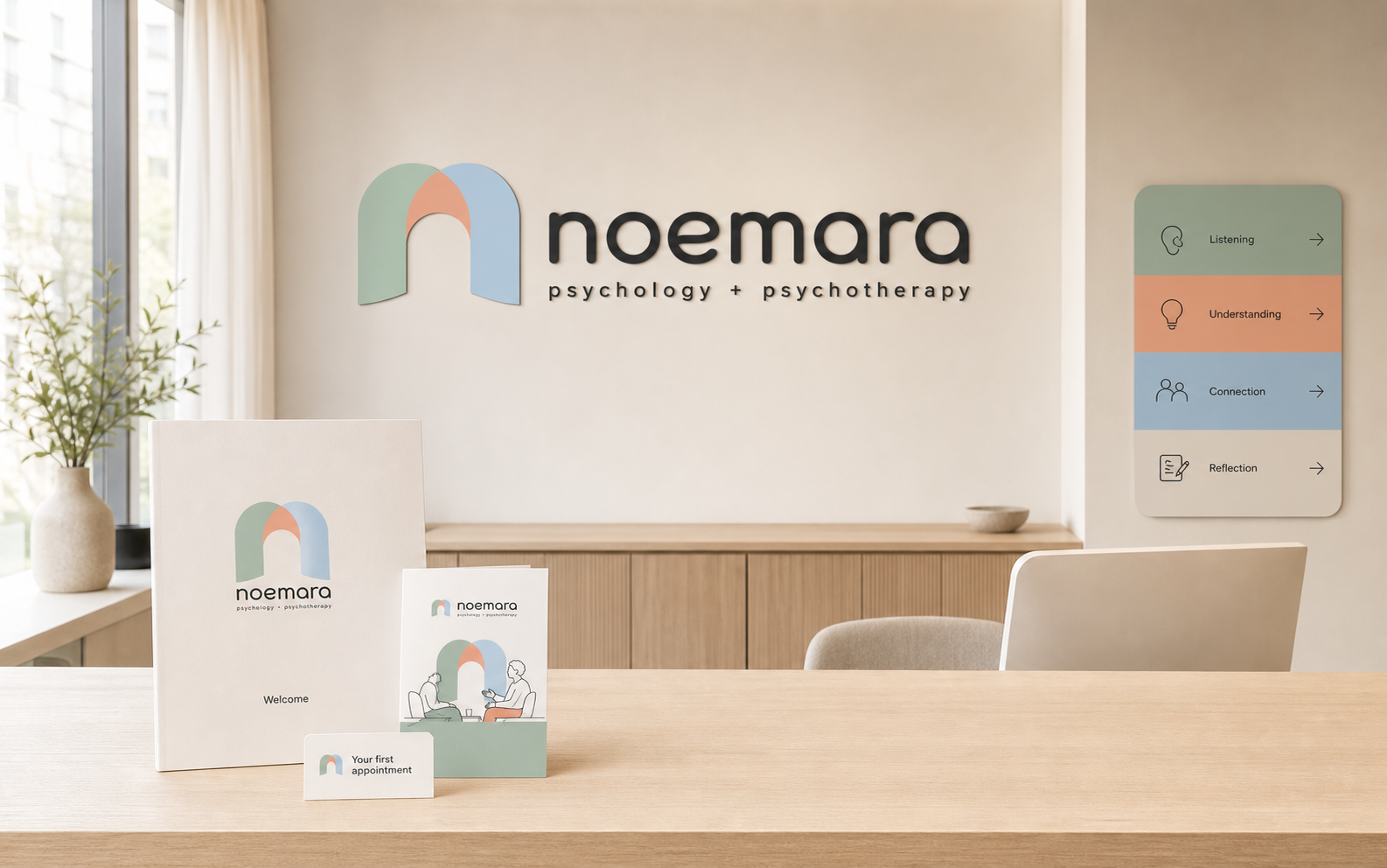
01 · Brand foundation
Clinical clarity.
Human warmth.
Noemara needed to hold two kinds of trust at once: the reassurance expected from psychotherapy and the precision required of psychological assessment.
The name is inspired by noema—something perceived or understood. Its softer, name-like ending makes the idea approachable and memorable without describing therapy too literally.
The resulting identity is calm without becoming vague, professional without feeling institutional, and accessible across cultures and stages of life.
02 · Concept development
A threshold
toward understanding.
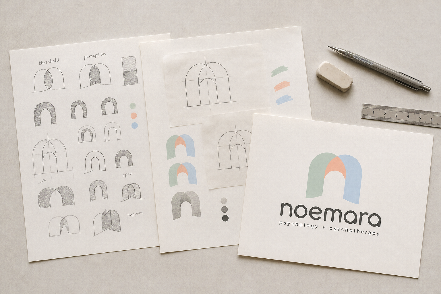
Overlapping fields acknowledge that understanding can hold more than one perspective.
A central protected space gives the mark its sense of care, privacy and steadiness.
03 · Logo, type & colour
Soft enough to welcome.
Clear enough to trust.
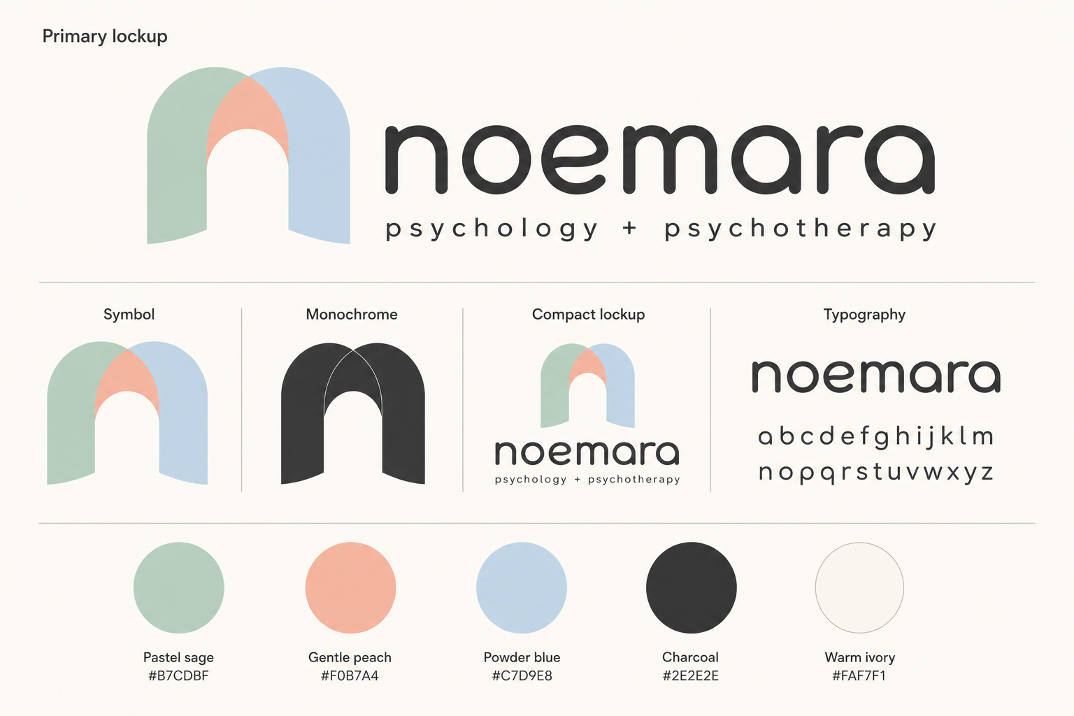
A lowercase humanist wordmark gives the practice an approachable voice while retaining the precision required of clinical communication.
Sage signals steadiness, peach adds human warmth and powder blue brings clarity to assessment-related information.
The mark remains recognisable in monochrome for reports, referrals, signage and practical clinical applications.
04 · Illustration system
More than a logo.
A visual language.
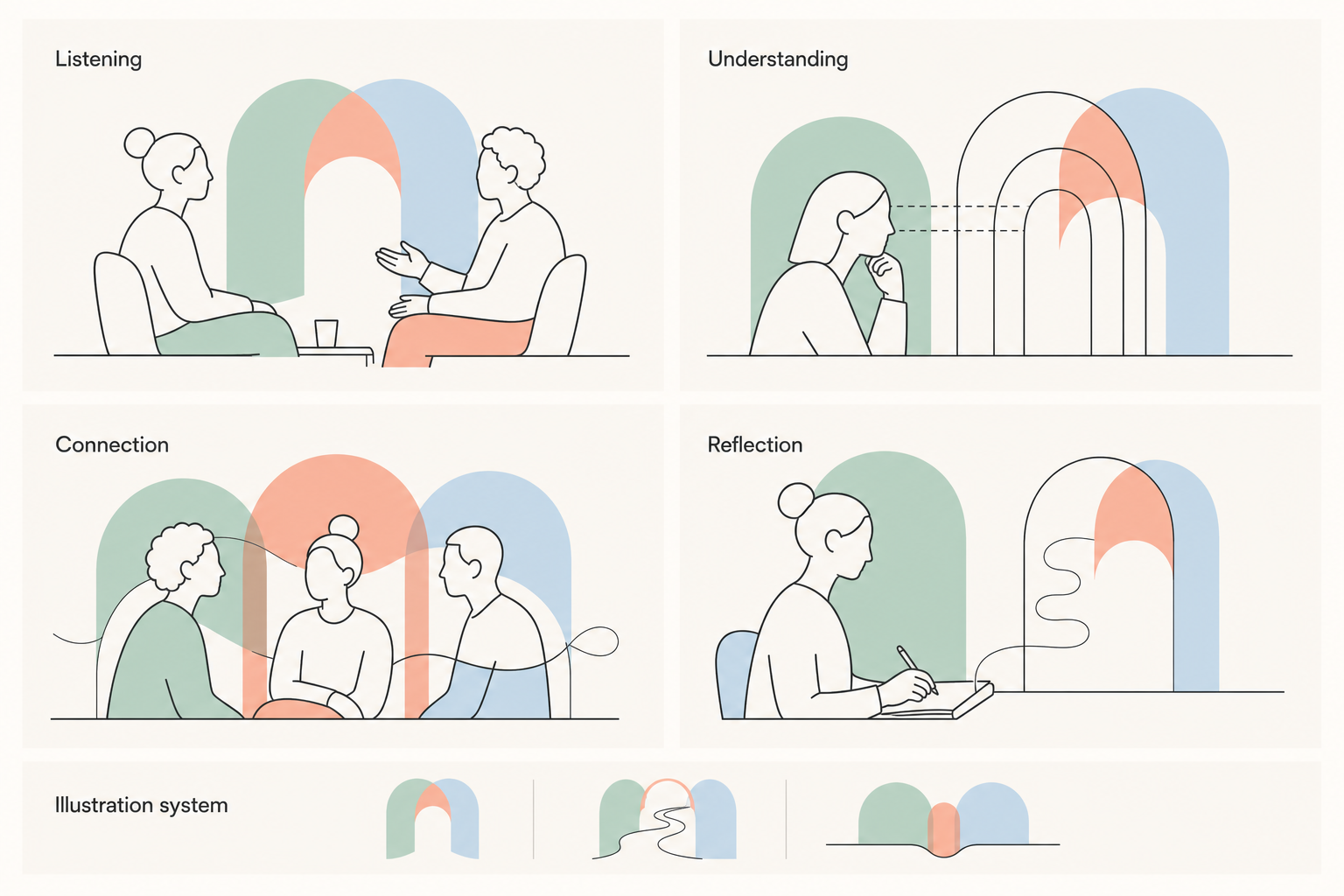
A flexible family of line illustrations makes abstract parts of the care experience easier to communicate—without labels, diagnoses or generic wellness symbols.
05 · Service architecture
Three paths.
One considered practice.
Psychotherapy
CBT, mindfulness and existential therapy for teens and adults.
Autism diagnostic evaluation
Comprehensive, affirming evaluation supported by ADOS-2.
Psychological assessments
Evidence-informed evaluation for learning, attention and planning.
06 · Office stationery
Consistency across
the practice.
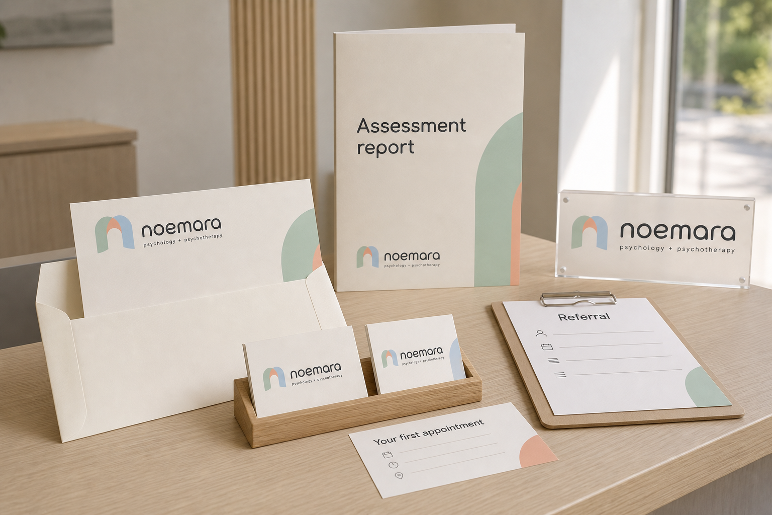
Referral forms, assessment reports and patient literature carry the same quiet hierarchy—supporting confidentiality, navigation and recognition throughout the care journey.
07 · Patient communication
Information that feels
considered and human.
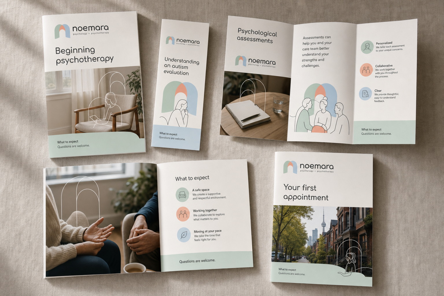
Brochures combine practical guidance, respectful photography and the illustration system to explain what therapy and assessment involve before a first conversation begins.
08 · Website · Ongoing
Bringing the identity
into a working service.
Ongoing work
The website is being developed as the next expression of the identity: a clear route for clients, families and referring professionals to understand the practice and find the right support.
