
01The milky sea
Coconut
A crescent bowl, an impossible tide, a little staircase to nowhere.
Something deliciously out of the ordinary.
01—06 / A flavour of elsewhereSmall bars.
Strange little worlds.
01 / The idea
What if a chocolate wrapper felt less like a label—and more like the cover of a very small adventure?
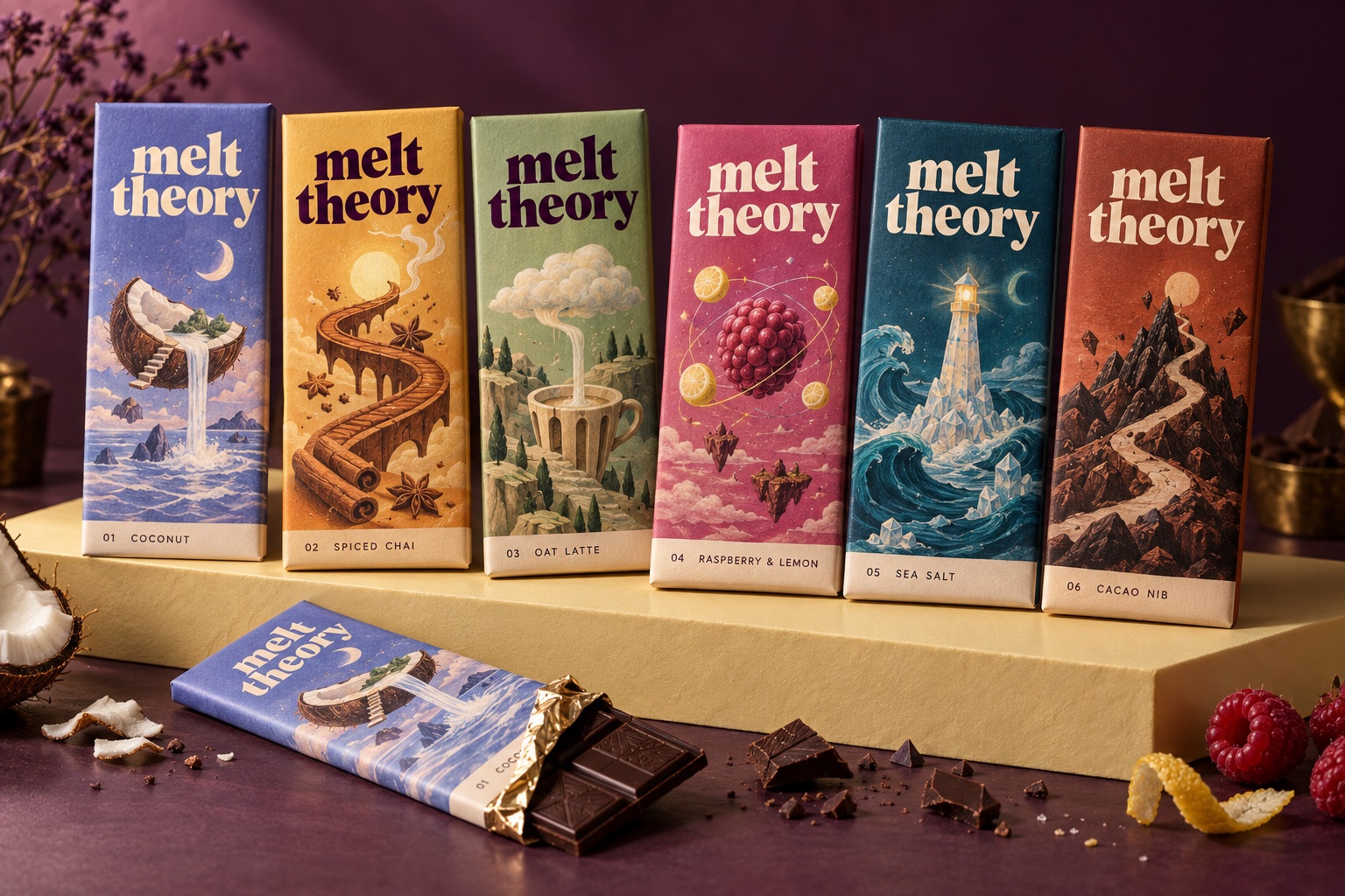
Melt Theory is an independent concept built around that thought. Familiar flavours become unfamiliar places: a milky sea, a cinnamon sun, a cloud café. A moment of everyday indulgence becomes a small departure.
02 / A softer kind of bold
“Melt” is the sensation. “Theory” is the invitation to imagine. A generous serif wordmark brings warmth; small, precise flavour labels give the worlds beneath it a clear structure.
melt
theory.
03 / Illustration worlds
Not literal ingredients on a wrapper. Each flavour gets an imaginary landscape, a distinctive colour and a small story of its own.
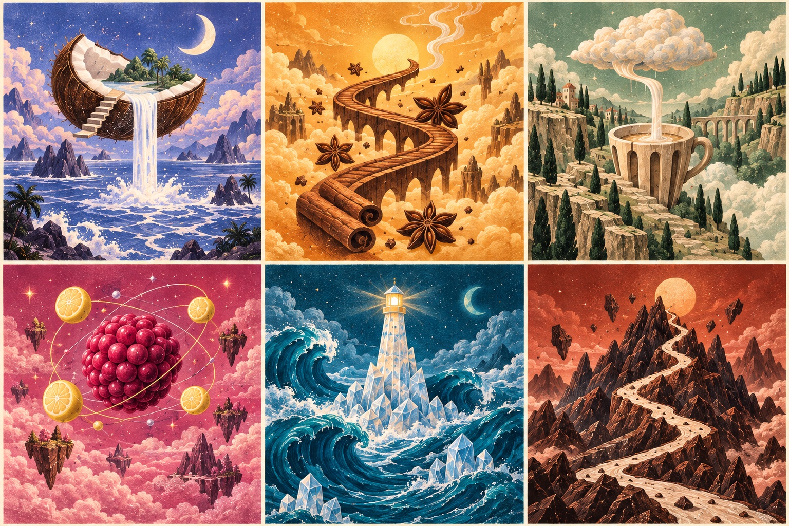
A crescent bowl, an impossible tide, a little staircase to nowhere.
A curling bridge leads into the warmth of an imaginary sun.
A soft cloud pours a ribbon through a quietly impossible cup.
Tiny lemon moons circle a berry planet. A bright little detour.
A salt-crystal lighthouse keeps watch over an undulating sea.
A cream-coloured path winds through a landscape of cacao pebbles.
04 / The system
A consistent wordmark and flavour label make every bar recognisably Melt Theory.
Colour and illustration carry the personality. Each pack earns its place in the collection.
Clear hierarchy keeps the artwork generous and the choice simple.
05 / Out in the world
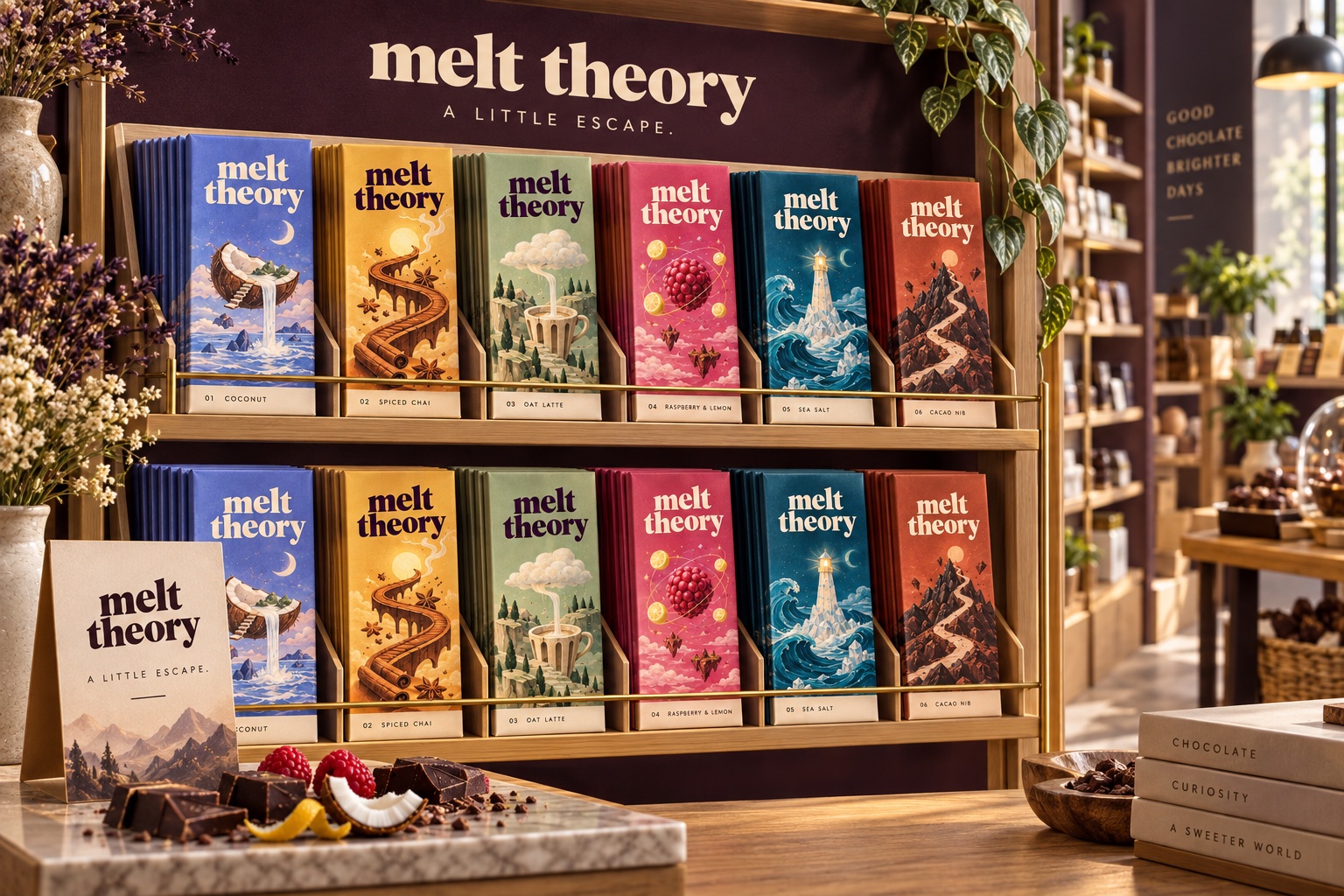
A colour-led collection in a quiet retail setting. Repeated packs form a little gallery—something to explore, not just pick up.
Melt Theory