
Balance
Distribute visual weight until every element feels intentional.
FORM / SEVEN asks a simple question: how much identity can be created using only the fundamentals?
Strategy · Identity · Objects · Digital · Retail
No visual effects. No ornamental language. No trend added for attention. The identity is constructed from proportion, order, rhythm and space—then tested across a complete brand rather than left as an abstract poster exercise.
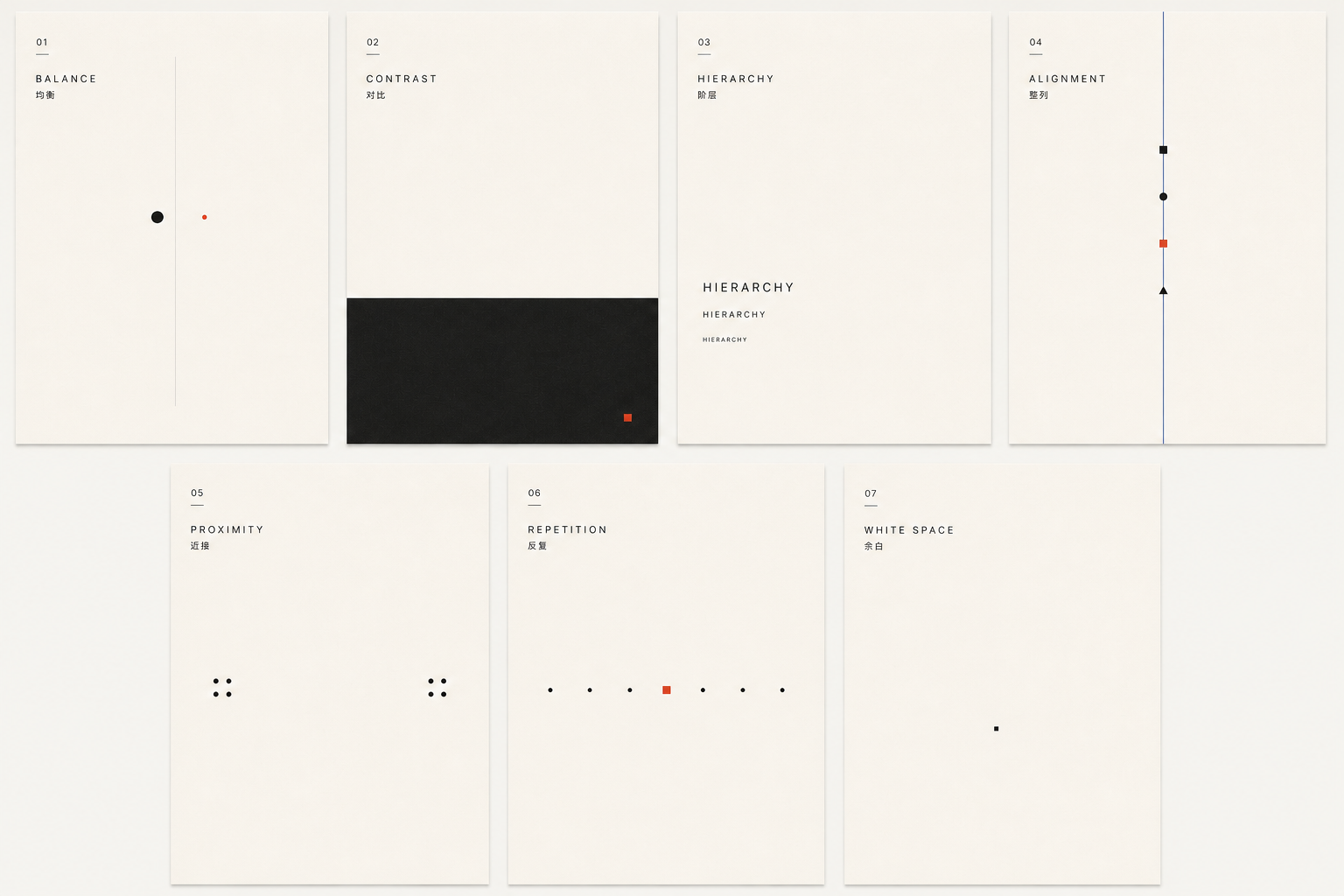
Distribute visual weight until every element feels intentional.
Use difference sparingly, so the important thing becomes unmistakable.
Give every message a clear first, second and third reading.
Let an underlying grid turn separate parts into one system.
Place related ideas together and remove the need for explanation.
Repeat just enough to create recognition, rhythm and memory.
Leave room for the object, the message and the viewer to breathe.
The seven-square signature turns repetition into recognition. A single grid controls labels, wraps and pack proportions. Colour creates contrast, while generous margins keep every object calm.
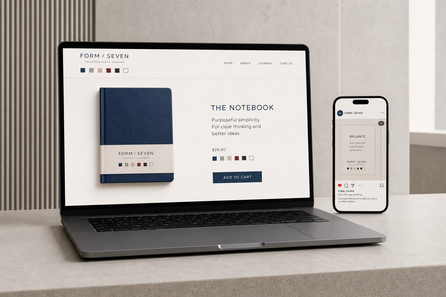
Product, message and action follow one reading order. Alignment connects the interface; proximity clarifies the content; white space makes the experience feel considered rather than empty.
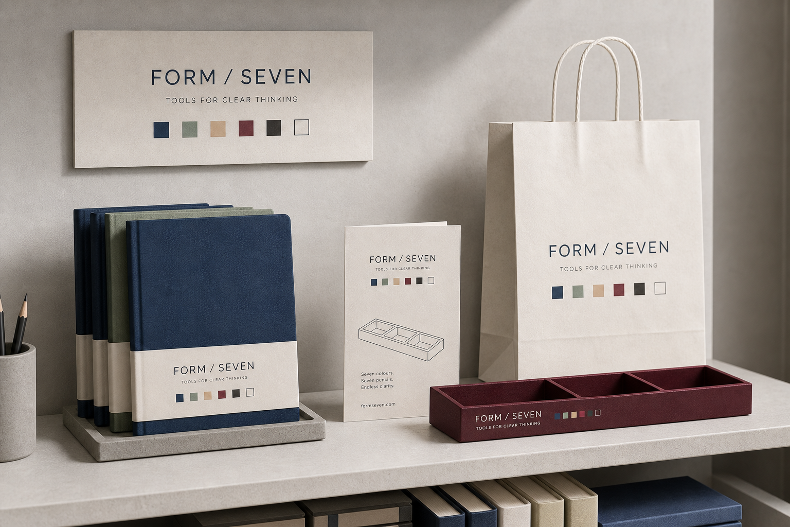
The system extends without becoming louder: uncoated paper, cloth covers and durable desk objects give the same seven principles a tactile life.
Nothing is added unless it improves recognition, use or understanding. Simplicity is not the absence of an idea—it is the evidence of a resolved one.