
Near, not noisy
A downtown stay that remains connected to Toronto while offering genuine visual and emotional quiet.
Same name.
Same city.
Quiet retreat
Considered · Restorative · Private
Cultural house
Social · Energetic · Connected
A quiet urban retreat designed around the feeling of leaving the city—without actually leaving it.
Strategy · Identity · Guest experience · Digital · Environment
Much of urban hospitality competes through spectacle. Elsewhere House takes the opposite position: calm can be the memorable part.
The concept imagines a small Toronto hotel for design-aware travellers who value thoughtful space, local character and service that does not constantly ask for attention.
A downtown stay that remains connected to Toronto while offering genuine visual and emotional quiet.
Tactile materials and restrained service replace familiar signals of performative luxury.
The neighbourhood is introduced through small, useful recommendations rather than a checklist of landmarks.
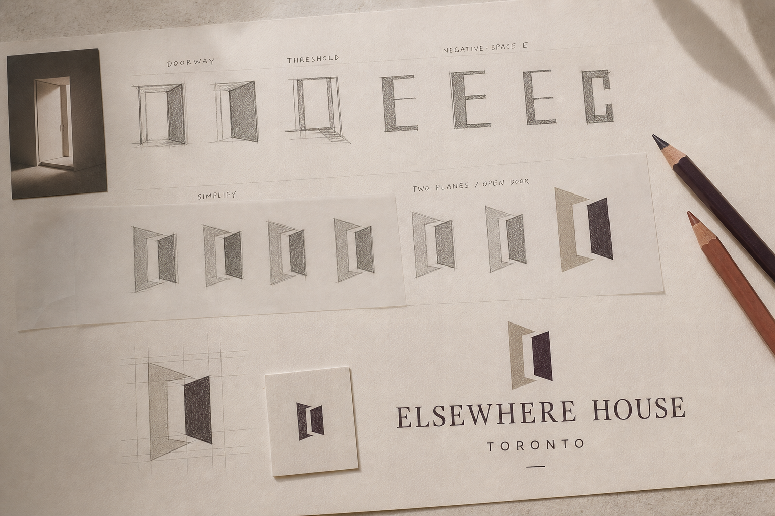
The mark begins with the most meaningful moment in any stay: crossing a threshold. Two offset planes create an open passage; the negative space quietly suggests an E.
The symbol works as a single-colour stamp, room marker, digital cue and spatial object—distinctive enough to recognise without becoming decorative.
An editorial serif gives the house a literary character, while a neutral sans-serif handles practical information. Limestone, clay, aubergine and moss echo the interior without turning it into a lifestyle cliché.
Elegant enough for arrival; calm enough for everyday use.
“Step inside, take a breath, and let the city settle outside.”
Brief, warm and useful. Never overly familiar or promotional.
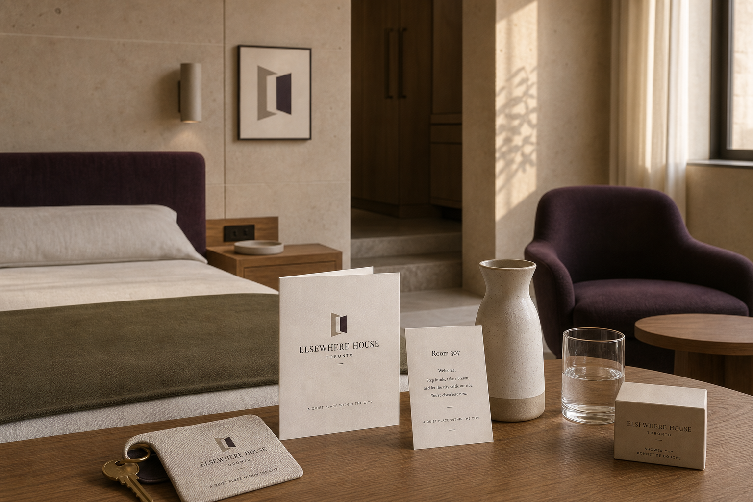
Each object earns its place. A woven key sleeve feels tactile in the hand; the welcome booklet sets the tone; the room card gives only the information needed to settle in.
Editorial campaign imagery creates desire through atmosphere, not offers.
A concise three-step flow keeps dates, room choice and confirmation clear.
The open-threshold symbol becomes a recognisable cue from street to lobby.
Room materials explain only what is useful, then leave space for the stay.
A considered neighbourhood guide connects guests to nearby independent places.
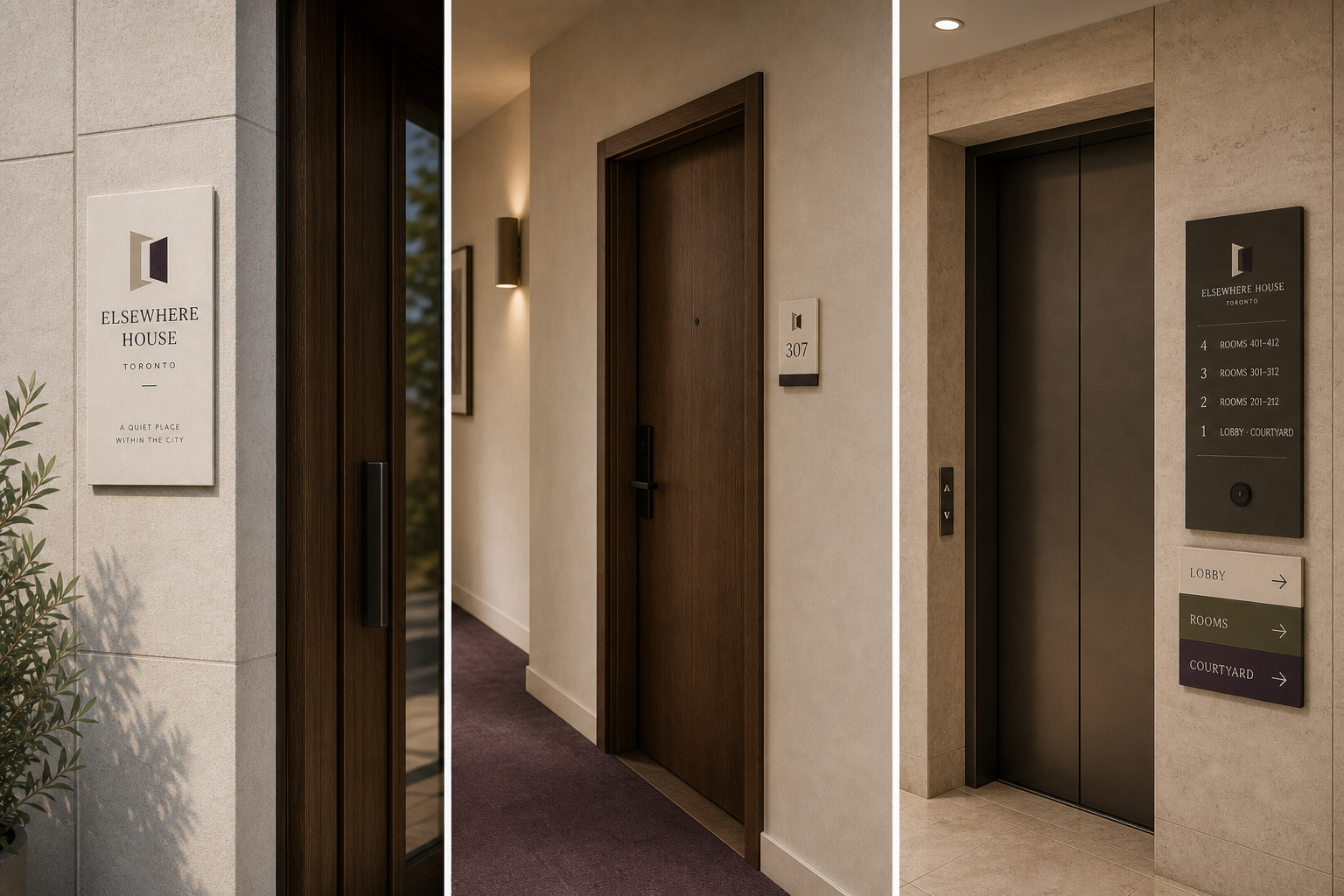
Wayfinding uses architectural planes, high-contrast information and consistent placement. The system feels part of the interior while remaining readable at a glance.
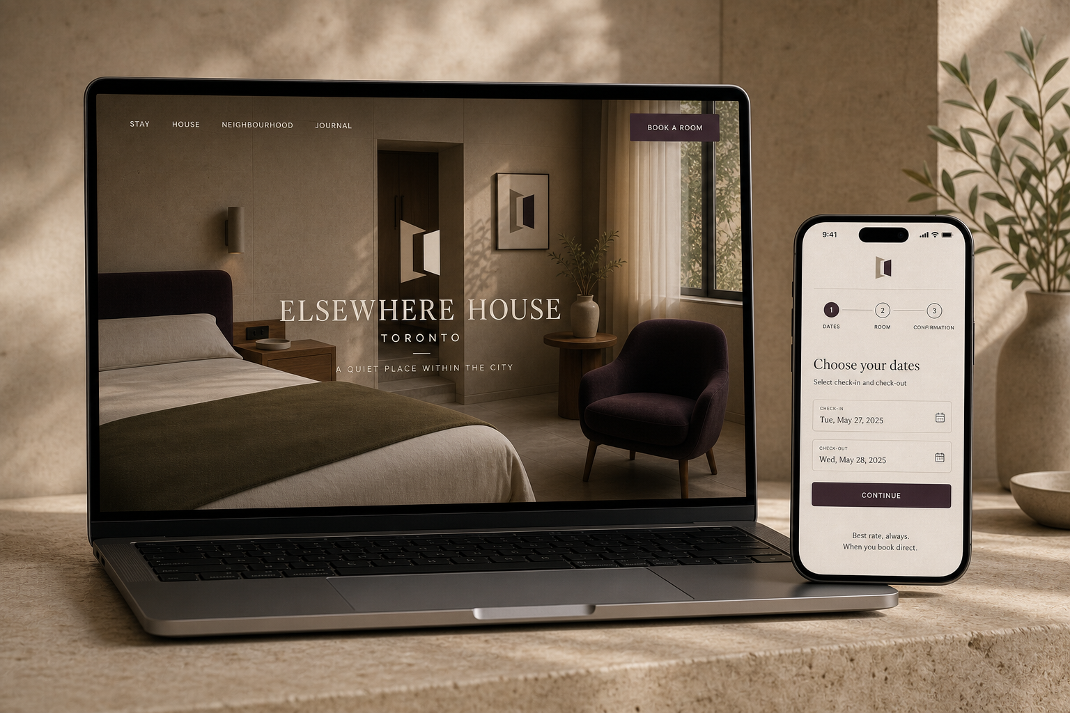
The house is understood through space, light and a concise point of view.
Dates, room and confirmation remain visible throughout the booking flow.
Transparent information replaces urgency messages and unnecessary persuasion.
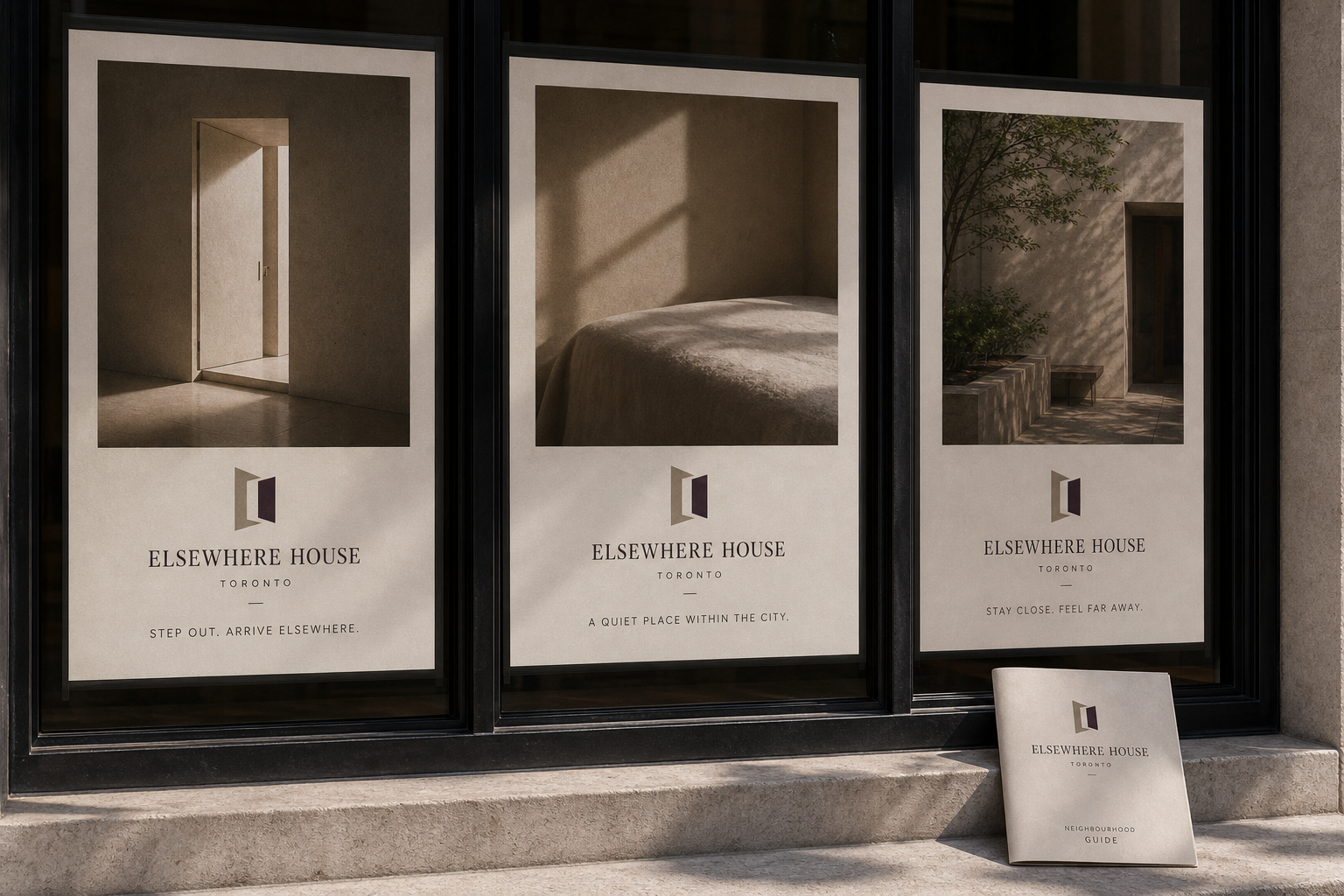
The campaign makes stillness distinctive. Architectural moments and short lines invite the viewer to imagine a feeling rather than compare a list of hotel features.

The second direction reframes Elsewhere House as a social base for people drawn to independent music, food, art and the city after dark. Energy replaces escape; participation replaces privacy.
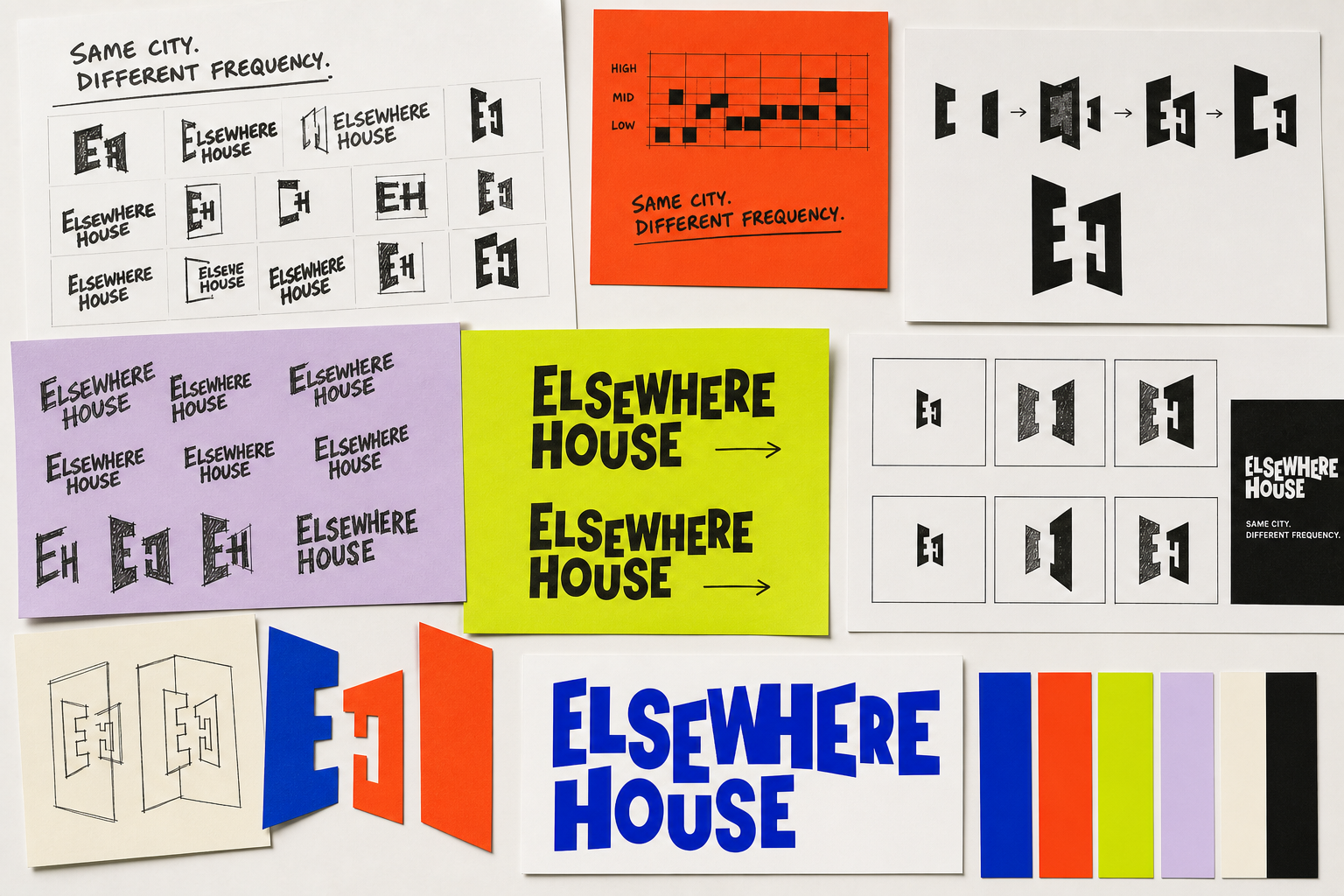
The same threshold idea is rebuilt as motion. Letterforms shift sideways, stretch and change baseline; the EH planes open and close like a visual beat. It remains a doorway—but now it invites people into activity.
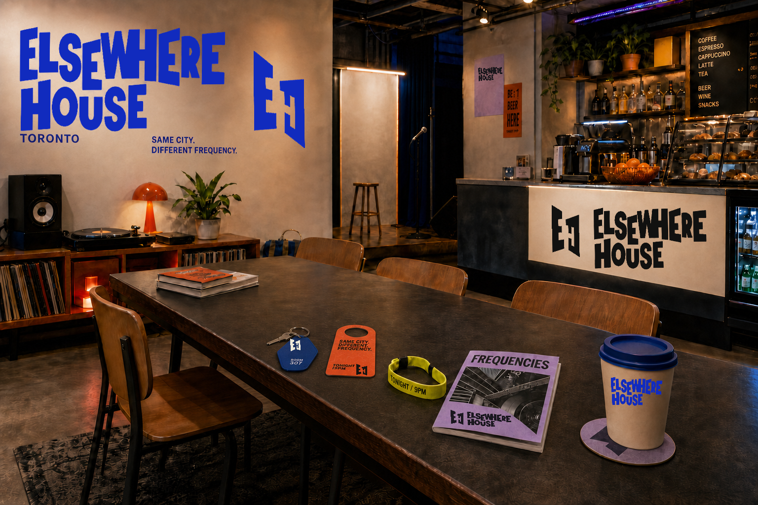
Rooms remain calm enough to rest, while the public floor carries the energy.
A communal table, listening corner and café make connection feel natural.
The city zine and nightly programme turn local culture into part of the stay.
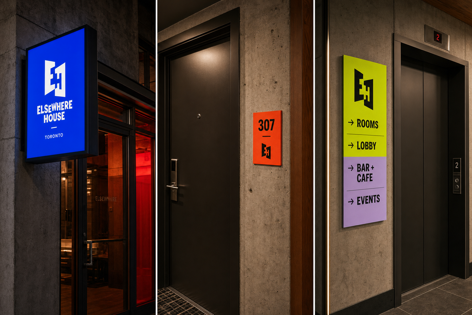
Each application lives where it is needed: the cobalt lightbox identifies arrival, orange marks guest rooms, and chartreuse with lilac guides people through shared spaces beside the elevators.
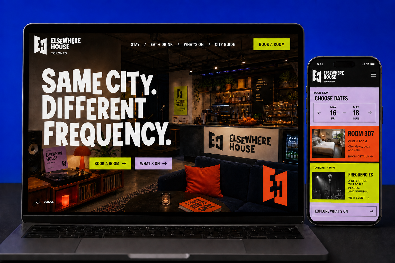
Rooms and dates stay direct, accessible and easy to compare.
Events are part of the core experience rather than hidden in a journal.
Food, sound and neighbourhood recommendations share one visual rhythm.
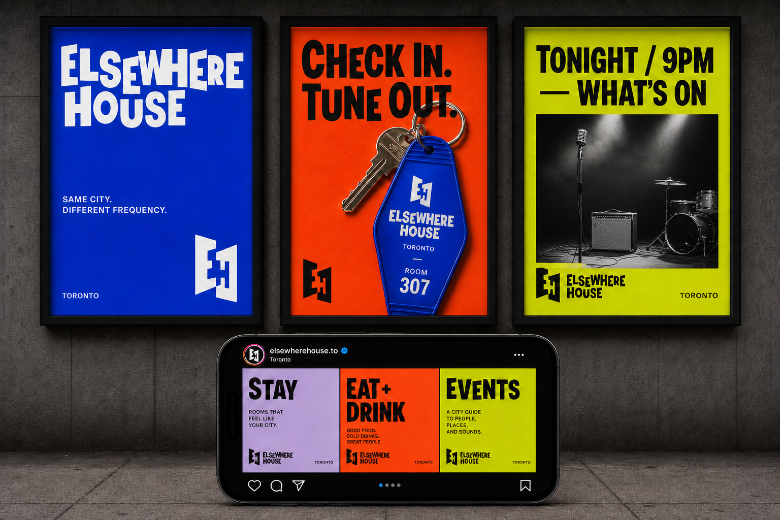
A modular campaign switches between stay, food and events without losing recognition. The shifting wordmark carries the brand; direct copy gives every message its own frequency.