Own the name
Oversized type turns the unusual double-G into the product's strongest memory cue.
Speculative product revitalisation · Pakistan
A bold new identity for an established fizzy apple drink—created to feel clearer on shelf, younger in culture and more alive across every format.
Strategy · Identity · Packaging · Campaign
01 · The opportunity
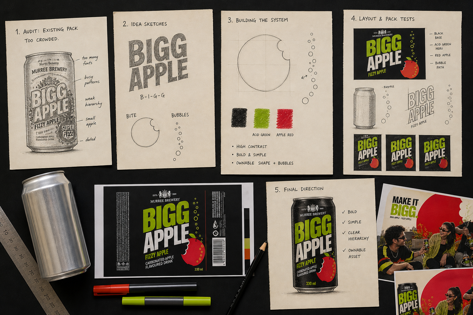
The existing product had recognition, heritage and an unusually memorable name—but its label carried too many visual messages at once.
The revitalisation gives Bigg Apple a clear hierarchy, an ownable symbol and a system designed for the places where a younger audience actually encounters the brand.
02 · From audit to idea
03 · Design system
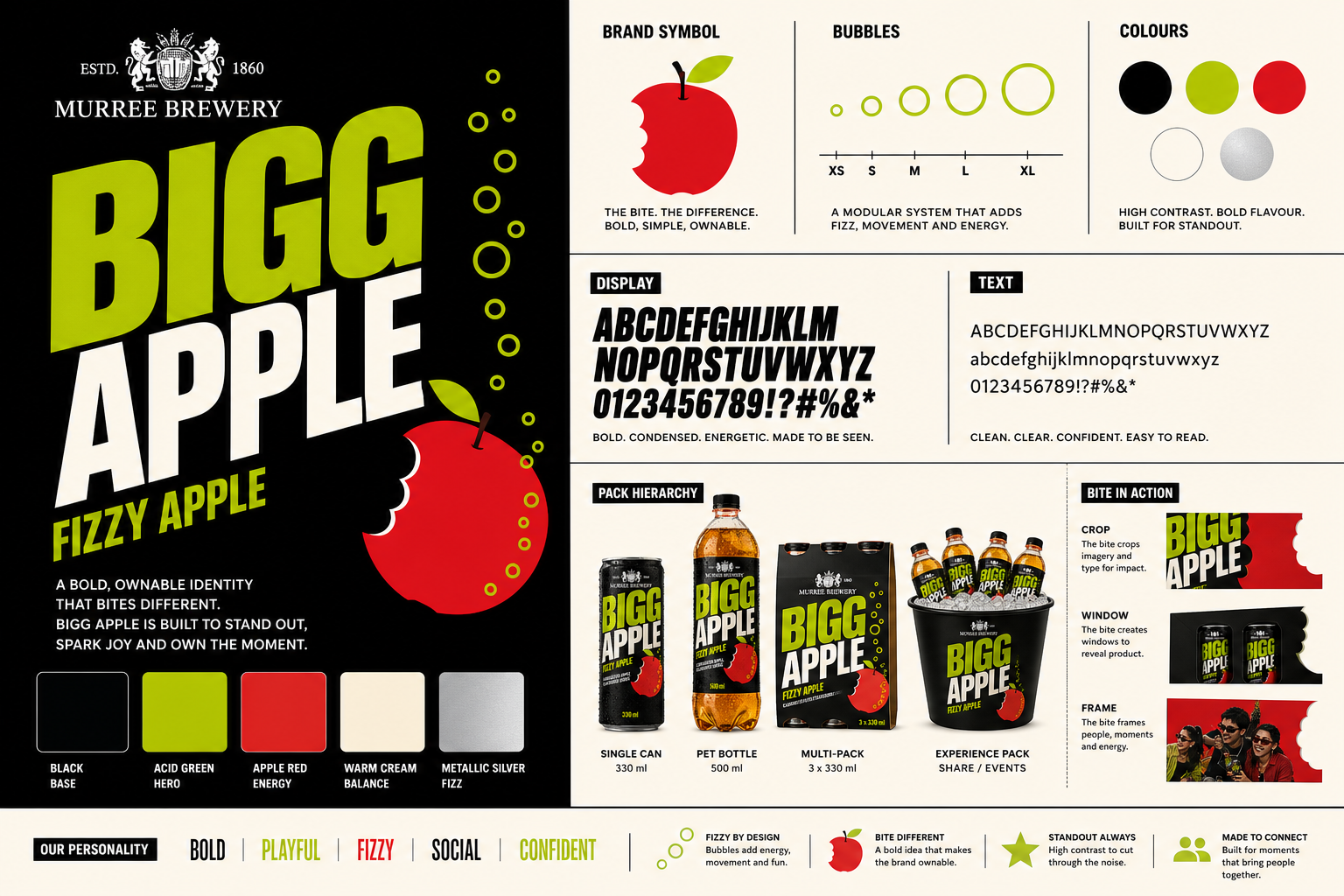
Oversized type turns the unusual double-G into the product's strongest memory cue.
A modular bubble trail introduces movement without relying on familiar splash photography.
The bitten red apple works as an icon, crop, frame and unmistakable campaign asset.
04 · Campaign expression
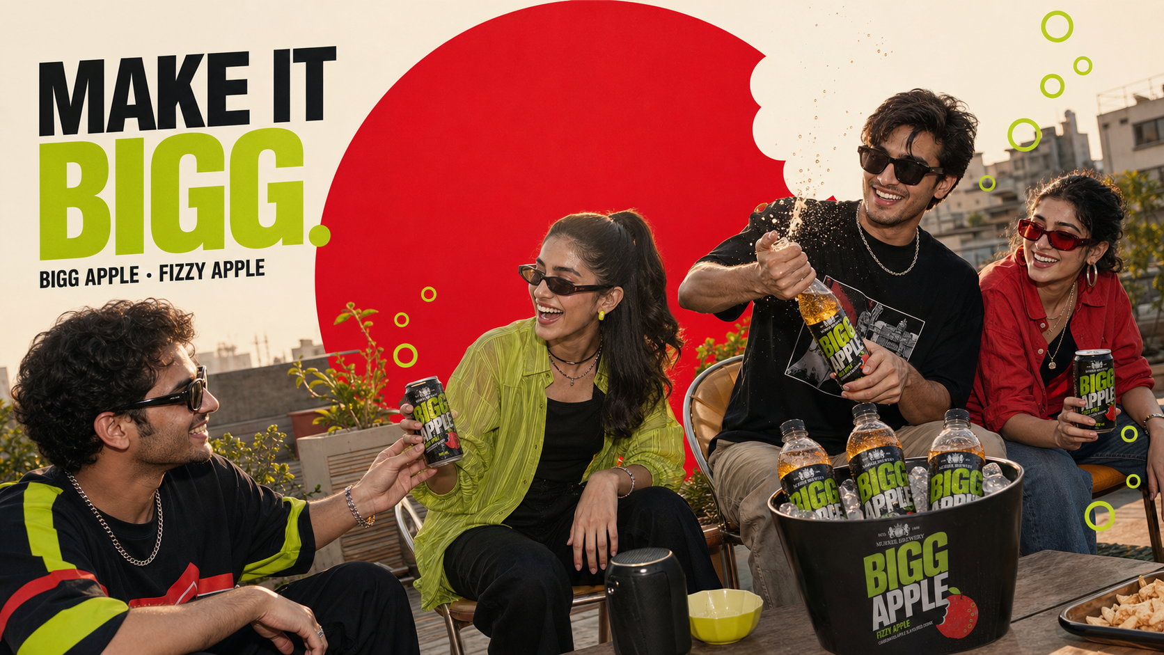
The campaign centres on real social energy rather than posed product endorsement. The red bite creates instant recognition while acid-green bubbles connect the photography back to the pack.
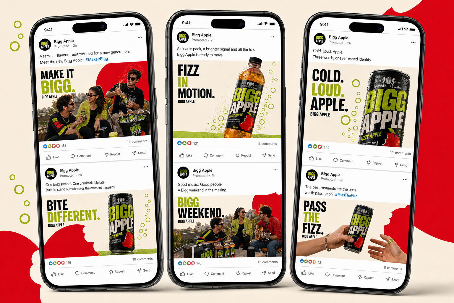
05 · Social system
Product, people and graphic storytelling alternate across a flexible feed—giving launches, weekends and flavour moments distinct compositions without losing the brand.